
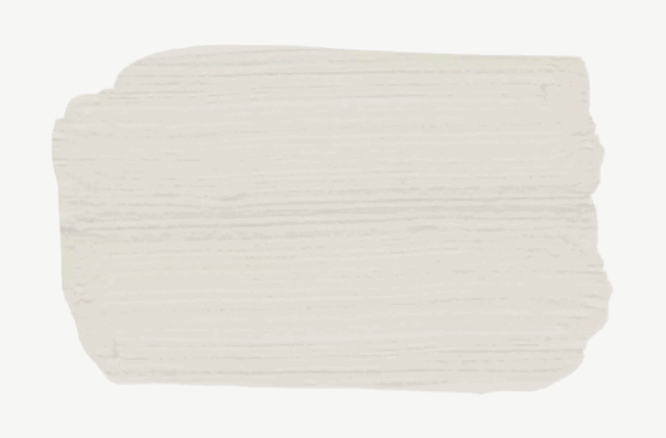
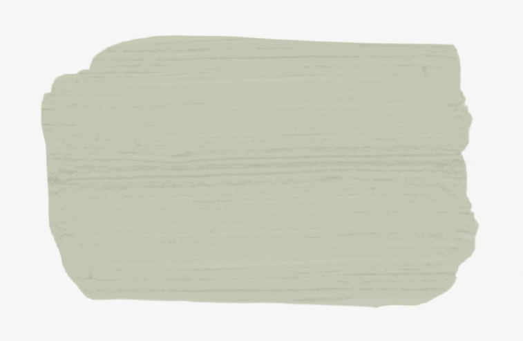
Best Shade of Light Gray: Benjamin Moore Classic Gray 1548
“One of my favorite paint colors for living rooms is Benjamin Moore, Classic Gray,” says Canadian interior designer, Karen Sealy. “As the name states, it is truly timeless and will never be out of fashion. It is the perfect backdrop for any space—it helps bounce light, which makes a room feel brighter and airy. It is also a great choice if you are looking to create a gallery wall. It really allows the artwork to take center stage.”
You can never go wrong with a solid neutral, and Benjamin Moore’s Classic Gray is a stylish option for any living room. It’s not too deep of a shade, which makes it a versatile background color for any style preference. Interior designer Karen Sealy says, “As the name states, it is truly timeless and will never be out of fashion. It is the perfect backdrop for any space—it helps bounce light, which makes a room feel brighter and airy. It is also a great choice if you are looking to create a gallery wall. It really allows the artwork to take center stage.”
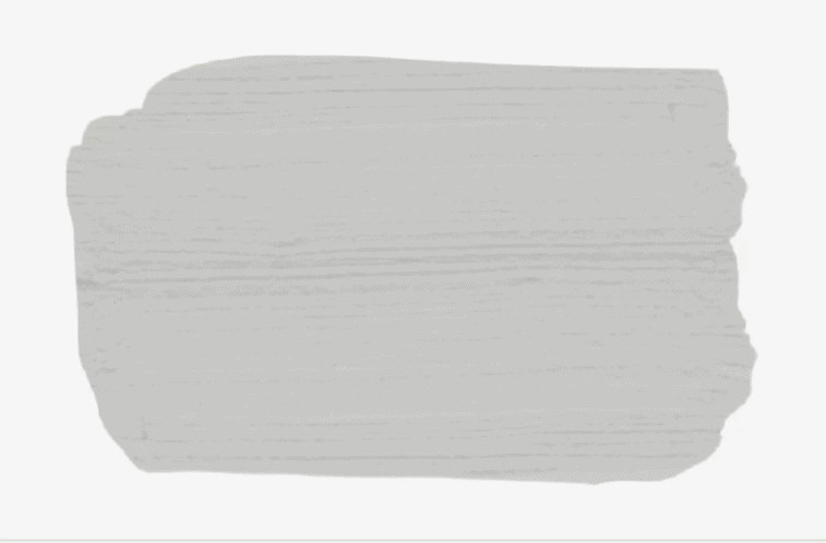
Best Alternative to White: Valspar Filtered Shade 4003-1B
This true gray is perfect for those of us who can’t decide between a cool or warm color palette. Because it’s a very neutral hue, you can really go either way with decor and accents. When you’re ready to upgrade your living room or change out the furniture, you won’t have to worry about finding a new color.
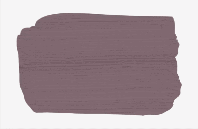
Best Shade of Purple: PPG Velvet Slipper 1046-6
“Purple is having a big moment,” says Don Torrance, the color expert at Paintzen, based in New York City. “Not only do we see this harbinger of spring on the runways, but it is also a hit on walls too.” Velvet Slipper by PPG exceeds expectations when searching for a good purple. It’s a dusty shade of violet that can function as neutral. How do you make it work? Elegant furniture with decorative accents in layered shades of purple. Think curtains, and accents pillows all topped off with a sparkling lighting fixture that shouts luxury.
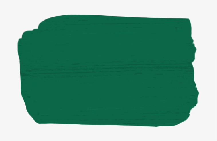
Best Shade of Emerald Green: Behr Precious Emerald S-H-470
Interior designer Tara Polony says, “Precious Emerald by Behr looks heavenly when paired with bright white trim. It gives the main living area an introspective air of a wooded glen.” Deep green shades have been trending for quite some time in the form of accent pieces, but using it to paint your wall shows this stunning color’s potential as the main focus of a room.
Best Shade of Light Green: Benjamin Moore Soft Fern 2144-40
For giving her home and air of spring year-round, Tara Polony uses Soft Fern by Benjamin Moore. “It is a super light pastel green. The calming shade is light enough to match any brown, gray, or cream-based color scheme while adding a pop of soft color to your living room.” Aside from a nod to warmer seasons, the shade is soothing and evokes a spa-like feeling.
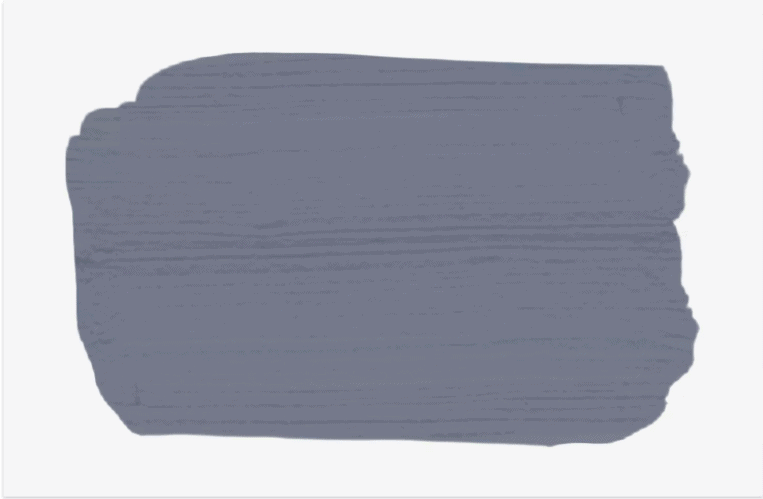
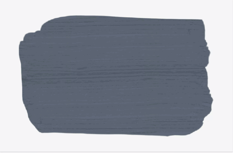
Best Shade of Dark Gray: Valspar Seattle Haze 4003-4B
Sue Kim, a color expert at Valspar, recommends a hazy blue called Seattle Haze by Valspar to drown out the chaos of everyday life. Paint on all four walls to transform the room into an inviting cocoon. The color works beautifully with natural wood and beige tones.
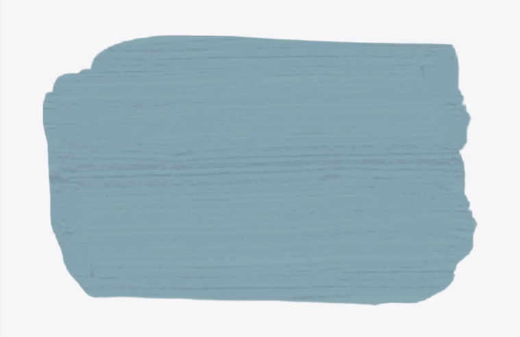
Best Shade of Dusty Blue: Magnolia Home Winter Solstice
According to New York City-based architect John Mochelle, this specific shade is inspired by the ever-popular farmhouse style. “[It] lends coziness to living rooms even on freezing February or March mornings. Once spring comes, the hue will come to life as days become longer. Pair with white trim for a traditionally beautiful and cozy living room,” he says.
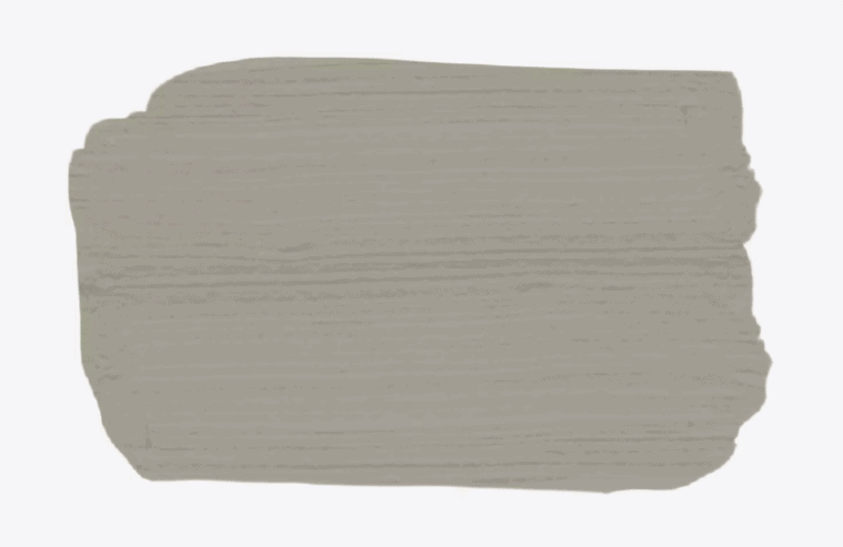
Best Shade of Taupe: Benjamin Moore River Reflections 1552
This earthy taupe will be quick to warm up any room. It looks best with cream or white accents, but can just as easily be paired with different natural woods without clashing. Experiment with this color on your walls in a matte finish for an updated, modern take on a classic shade.
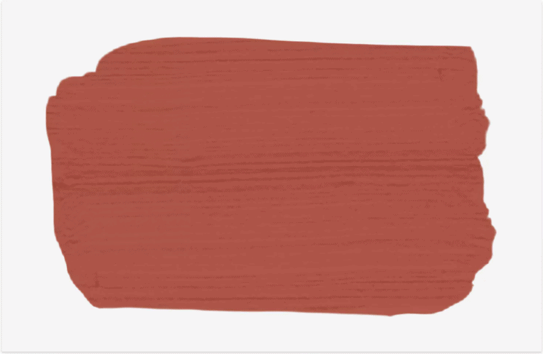
Best Shade of Reddish Orange: Persimmon Orange by The Spruce SPR-01
“A rustic shade of red on a single accent wall can enliven a living room without being overwhelming,” says New York City architect John Mochelle. “Persimmon Orange, by The Spruce is a reddish hue that looks spectacular with natural wood furnishings and light blue accents.”
Persimmon Orange by The Spruce SPR-01
Best Shade of Navy Blue: The Spruce Best Home Spectral Blue SPR-17
Sell it to us at Ohana Legacy Properties.